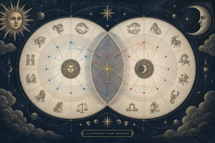
Imagine the same synastry chart in two different colors
Imagine Maria opens a synastry wheel on her phone before meeting her partner for dinner. One website draws a thick red line between her Venus and his Mars. Another draws the same connection in blue. A third uses a thin green line. Maria wonders which report she should trust. She isn't really asking about color. She wants to know whether the connection is strong, what kind of contact it is, and what the two charts may bring into the relationship.
The answer begins with a clean separation. A chart's colors belong to its display system. An aspect belongs to the angular relationship between two chart factors. Those are related because a site uses color to help you see an aspect, but they aren't the same thing. The line is a visual label. The aspect name is the astrological information. The distinction is the first thing to settle.
That distinction changes how you read the wheel. Don't decide that red means bad, blue means good, or green means a special relationship before you find the legend. A display may use color for aspect family, for the two people, or for a broad tone such as ease and tension. It may also let you change the palette. The same hue can therefore carry a different job from one website to the next.
Astrodienst describes synastry as a comparison of two horoscopes that reveals interaspects between one chart's planets or axes and the other chart's factors. Its chart-type guide also separates the wheel from the accompanying data sheet and aspect table. That is a useful clue. The wheel helps you see the pattern. The table helps you name and verify the contact.
So when the same line changes color, ask what job the color performs on that page. Is it naming the aspect? Is it marking one partner's planets? Is it showing a harmony-and-tension category? Is it simply part of the selected theme? The question is small, but it stops a visual convention from becoming an emotional conclusion. If the contact row, degrees, and orb are unchanged, a palette change hasn't rewritten the synastry.
If it doesn't, keep reading. A disagreement may come from a different orb, a different list of included aspects, a different zodiac reference, or a mistaken reading of which planet belongs to which person. The color is rarely the hardest part. It is simply the part your eye notices first.
This is the question underneath Maria's confusion: what can remain stable when the picture changes? Start with the contact's sentence. Person A's Venus meets Person B's Mars by conjunction, with a 1-degree 20-minute orb. That sentence preserves the people, the planets, the aspect, and the closeness. A color change can't erase it. Nor can a dramatic paragraph that never names the contact.
When two readers notice different lines, give each observation a job. The brightest line may be a palette choice. The thickest line may be the tightest orb. Several lines around the Moon may reveal a repeated theme. None of those observations is wrong, but they aren't interchangeable. Ask first whether you are trying to identify a contact, rank its closeness, or understand a pattern. Then use the visual cue that answers that question. This three-part audit is more useful than arguing over which site has the correct colors.
Sources: Chart Drawing Styles: Hellenistic - Astrodienst; Synastry Chart Calculator - Augurine; Definition of Major Aspects in Astrology - AstroLibrary
Read the legend before you read the emotional story
A synastry wheel invites a fast emotional response. You see a web of lines and want to know which ones show attraction, ease, tension, or distance. That's natural. But the wheel has a grammar, and the legend is its key. Read that key before you attach a story to a color.
Start with the chart type. A synastry chart may show two planetary rings with cross-chart aspects. A composite chart answers a different question because it creates a relationship chart from the two charts rather than simply comparing their interaspects. A natal chart with transits adds yet another layer. If you compare colors across these chart types, you may be comparing different systems while assuming you're looking at the same one.
Next, locate the aspect legend. Look for labels such as conjunction, opposition, square, trine, sextile, quincunx, or semisextile. Then inspect the other visual channels. Does line weight change? Does a dashed line mark a wider contact? Are the two people identified by different ring colors? Is an aspect symbol printed beside the line? A chart can encode four facts at once, and a reader who assigns every fact to color will misread the picture.
AstroLibrary's major-aspect reference gives the five familiar relationships: conjunction at 0 degrees, sextile at 60, square at 90, trine at 120, and opposition at 180. Astrodienst's Astrowiki defines the orb as the allowed distance from the exact angle. Those two facts matter more than the hue of the line.
Now read the page in layers. First identify the rings and the chart type. Next identify what line color names. Then identify what line weight or pattern adds. Only after that should you inspect the selected bodies and aspects. This order matters because visual systems do not agree about which channel carries which meaning. One chart may make red an aspect family. Another may make red one person's planets. A third may reserve red for a tension label in a grid.
The visual shape still has a stable purpose. A synastry bi-wheel places two charts together so you can see the conversation between them. The rings tell you whose factor you are following. The center shows the contacts. A grid or data panel can then turn that crowded center into rows and columns. The wheel is spatial. The grid is verbal. Use each for the job it handles best.
Use this visual reading order. First, identify which ring each endpoint belongs to. Second, name the planet or point at both ends. Third, read the aspect symbol or table label. Fourth, ask what the color, thickness, and line pattern each mean on this page. Fifth, bring in the planet meanings. Venus-Mars tells a different story from Moon-Saturn, even if both contacts use the same visual treatment.
Pay special attention when both people have the same planet near the same part of the wheel. A color legend for the rings may be more important than a color legend for the aspects. Trace the line to both endpoints, then say the contact aloud. Person A's Moon to Person B's Saturn is not the same sentence as Person A's Saturn to Person B's Moon, even though the geometric angle is shared.
The legend can also tell you what the site has chosen not to show. If minor aspects are hidden, a quiet space in the wheel doesn't mean the charts have no connection there. If house lines are omitted, the wheel cannot answer a house-overlay question. Read absence as a setting until you know it is meaningful. This is especially helpful when one report looks sparse and another looks crowded.
The legend is not a verdict. It is a translation key. Once you know what each visual channel says, you can return to the chart and notice patterns without confusing display emphasis with astrological meaning. That is the real use of color: faster recognition, followed by slower judgment. Save the legend with the report if you plan to share the image, because the same red line may be meaningless to someone using another chart style.
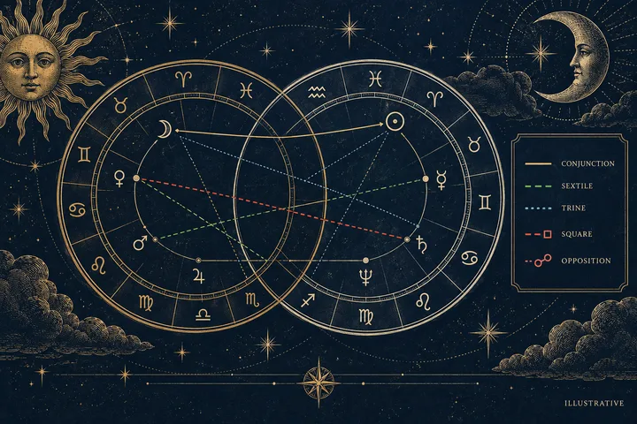
When synastry colors change between websites, read the legend as part of the chart rather than treating color as a universal code. Find out whether color marks aspect quality, the two people, or a custom theme. Then identify the planet pair, aspect name, degree distance, and orb. A red line can mean a square in one display and strong tension in another, while a thick line may signal closeness rather than difficulty. Use the wheel to notice patterns, but use the written contact or grid to name them. For a comparison based on supplied Moon, Venus, and Mars placements, preserve the signs and degrees, keep the report's zodiac and orb settings visible, and interpret only the contacts those inputs support. Color catches the eye. The verified contact carries the reading.
Sources: Chart Drawing Styles: Hellenistic - Astrodienst; Synastry Chart Calculator - Augurine; StarNavigator User Manual: Synastry and Compatibility Colors; Orb - Astrodienst Astrowiki; Definition of Major Aspects in Astrology - AstroLibrary
Use degrees and orbs as the stable reading layer
Once you know the legend, move from color to geometry. Astrology measures an aspect by the distance between two positions on the zodiac circle. The exact distance gives the aspect. The difference between that distance and the perfect angle gives the orb.
Here is the basic reference. A conjunction is near 0 degrees. An opposition is near 180 degrees. A square is near 90 degrees. A trine is near 120 degrees. A sextile is near 60 degrees. The names don't depend on whether a website paints the line red, navy, purple, or pale green. They depend on the angle. These are the five major aspects commonly used as the first geometry check; color comes later.
Consider an illustrative example, not a calculated personal chart. One supplied position is Venus at 14 degrees Taurus. The other is Mars at 16 degrees Scorpio. Taurus and Scorpio sit opposite one another, and the two positions are 178 degrees apart. That is an opposition with a 2-degree orb. If one wheel draws it red and another draws it violet, the color hasn't changed the contact. The planet pair, angle, and closeness still point to the same synastry layer.
Now change the second position to Mars at 12 degrees Leo. Venus at 14 Taurus and Mars at 12 Leo are 88 degrees apart. That is a square with a 2-degree orb. The line may have the same width as the first example on one website, yet the aspect has a different shape and a different way of moving through the relationship. Opposition asks two people to meet across a polarity. Square presses two needs into a problem that calls for action. Neither is automatically a sentence about the relationship's future.
Orbs also explain why one display looks quiet and another looks crowded. A site that admits a wider range will draw more contacts. A site with a tighter threshold will leave only the closest ones. This is not a difference in emotional tone. It is a difference in what the astrologer has allowed into the picture.
Orb practice varies by chart-drawing approach, planet group, and aspect. If a report gives no policy, rank the closest contacts first and treat a contact near the edge as supporting material. Don't throw the wider contact away. Just give it the right seat in the reading.
A six-degree orb is the stated scope for the Synastry Comparison Report connected to this publication. That doesn't mean every contact inside six degrees deserves the same weight. Exactness still helps you rank the reading. A contact at 0 degrees 40 minutes is tighter than the same aspect at 5 degrees 50 minutes. The first usually deserves your attention sooner. The second may add background tone, especially when other chart layers repeat it. The report's six-degree setting is a declared boundary for selected major aspects, not a promise that every included contact speaks with equal force.
Write the orb as part of the aspect, not as a footnote. Venus opposite Mars, 2 degrees, tells you more than Venus opposite Mars. It shows how close the contact is, and it lets another reader compare the same data. Precision turns a colored line into a reproducible piece of chart language.
Keep three questions apart. Is the contact present? How close is it? What do the planets signify together? The first is geometry. The second is weight. The third is interpretation. A close contact earns attention, but it does not tell you whether the connection feels warm, demanding, erotic, protective, or complicated until you read the planet pair and aspect action.
Be careful with sign-based shortcuts, too. Two planets can be in signs that suggest an easy element relationship without forming a close major aspect. Two planets can also form an exact aspect across signs, especially near a sign boundary. The chart's color may make the contact look obvious, but the degree record tells you whether the connection is exact, wide, or only a broad sign affinity. Keep those layers separate and your final reading will sound more precise.
The same rule helps when a report rounds degrees. Venus at 12 degrees 58 minutes may appear as 13 degrees, while another table keeps the minutes. That rounding usually won't erase a close contact, but it can matter near a threshold or sign boundary. Preserve the most detailed position available, and treat a rounded display as a readable summary rather than the original measurement.
Sources: Chart Drawing Styles: Hellenistic - Astrodienst; Synastry Chart Calculator - Augurine; Definition of Major Aspects in Astrology - AstroLibrary
A worked example: when the table and wheel seem to disagree
Consider an example. Someone opens two synastry reports for the same pair. In the first wheel, a thick red line joins Person A's Moon to Person B's Saturn. In the second, the line is blue and thinner. The first report calls it a square with a 1-degree orb. The second calls it a trine with a 5-degree orb. The reader is not facing a color problem anymore. The reader is facing two different claims about the contact.
Don't choose a story yet. Rebuild the contact from the data. Copy the Moon's sign and degree from Person A's table. Copy Saturn's sign and degree from Person B's table. Confirm which zodiac reference each report uses. Confirm that both reports place the same planet at the same degree. Then calculate or inspect the angular separation.
Suppose the table shows Moon at 8 degrees Gemini and Saturn at 9 degrees Virgo. The signs are in a square relationship, and the distance is about 91 degrees. That is a square with a 1-degree orb. The first report's description fits the geometry. The second report may have been read from the wrong line, may be using a different set of positions, or may have a data-entry problem. Its blue line does not overturn the degree record.
Now suppose the second report shows Moon at 8 degrees Gemini and Saturn at 13 degrees Libra. That pair sits close to a trine, about 125 degrees apart, with a 5-degree orb. The two reports are no longer describing the same input. Perhaps the birth time, location, date format, zodiac reference, or saved partner profile changed. The colors are only the visible symptom. The real difference is the chart data.
The useful lesson is not to crown the table over the wheel. Each format answers a different question. The wheel shows arrangement and repetition. The table shows the contact in a form you can quote. A grid can also reveal whether one planet keeps meeting several planets from the other chart. Read the shape first, then use the row to keep your language exact.
Read the row in both directions when the report offers mutual contacts. Person A's Moon to Person B's Saturn and Person B's Saturn to Person A's Moon describe one geometric contact, but the language can emphasize different roles. The Moon person may feel the contact through emotional response and safety needs. The Saturn person may experience responsibility, restraint, or the need to define limits. The geometry is shared. The planet roles are not interchangeable in the sentence.
After you verify the row, rank it. A close Moon-Saturn square usually deserves more attention than a wide minor contact simply because it is tighter and involves personal planets. But it still isn't the whole relationship. Look for supporting contacts. Does Venus connect with the Moon? Does Mars activate the same signs? Does Saturn also touch the other person's Venus or Mars? Repetition can make a theme more visible. A single line should open the reading, not close it.
Then bring the contact into ordinary life. A Moon-Saturn square may describe different needs around reassurance, timing, duty, or emotional restraint. Ask where that pattern appears. Does one person need a quick response while the other needs time before speaking? Does care arrive as practical help rather than warm language? The chart offers a symbolic pattern. The couple still has to observe how that pattern behaves.
The strongest reading holds both levels. The aspect table settles what the contact is. The planets and signs suggest what it may ask of the relationship. The couple's lived choices show how they use it. A changed color can't change the first level, and it shouldn't be allowed to decide the third.
If the table and wheel still disagree, freeze the example before you touch anything. Save the image, copy the contact row, and note the displayed settings. Then change one visual or calculation choice at a time. This matters because a chart that redraws several settings together can make a small change look like a new relationship pattern. A frozen before-and-after gives you something you can actually compare.
For a clean comparison, keep one short record for each report: chart type, zodiac reference, ring order, selected bodies, aspect list, orb, and the contact row in question. Add the date you saved it if the website changes its defaults often. This record separates a new picture from a new calculation and gives your partner a way to follow the reading without trusting your memory of a colored line.
Don't let a long automated interpretation outrank a short data row. A paragraph can sound certain while describing the wrong contact. The row gives you something you can check. Once the row is right, you can return to the prose and decide whether it adds a helpful interpretation or merely repeats the visual mood of the wheel.
Sources: Chart Types - Astrodienst; Chart Drawing Styles: Hellenistic - Astrodienst; Synastry Chart Calculator - Augurine; StarNavigator User Manual: Synastry and Compatibility Colors; Definition of Major Aspects in Astrology - AstroLibrary
Know when a color change points to a real setting change
Use a two-column test when you compare screenshots. Put visual changes on the left: hue, thickness, and line pattern. Put calculation changes on the right: positions, zodiac reference, aspect list, and orb. If only the left column changes, keep the same interpretation. If the right column changes, restart with the new contact data.
A useful habit is to record the display settings beside the screenshot. Note the chart type, zodiac reference, selected bodies, aspect list, orb, and line convention. This takes less time than trying to reconstruct the report after a site refreshes its defaults. The visual language is part of the instrument, but it is not the astrological judgment.
The first possibility is a custom palette. Many chart tools let users alter display colors, line styles, or the whole visual theme. In that case, the chart's geometry stays fixed while the screen changes. A saved preference can make a later report look unfamiliar even when the data matches.
The second is an aspect-family convention. Some systems use red for dynamic or challenging aspects and blue for harmonious ones. Other tools use three labels, such as strong tension, challenge, and harmony. StarNavigator's manual states that its red, orange, and blue compatibility colors are its own interpretation and that the legend belongs with that grid. That is the right way to read any such palette: as a method's visual shorthand, not as a universal dictionary.
The third is a changed aspect list. A report may include only major aspects by default, while another includes quincunxes, semisquares, parallels, or contraparallels. The extra lines can alter the visual balance of the wheel. They may also create a line that looks important simply because it is bright or unusual. Name the aspect before you rank it.
The fourth is a changed orb. This is the quiet setting that causes the most trouble. A wide orb can turn a nearly empty chart into a busy one. A tight orb can make a familiar connection disappear. If one report includes a 6-degree trine and another uses 3 degrees, the first may draw a line the second refuses to show. The difference isn't a contradiction. It is a threshold.
The fifth is a changed zodiac reference. Tropical and sidereal charts use different starting points for the zodiac, so a planet near a sign boundary can receive a different sign label. If both planetary positions are shifted consistently, their angular separation and aspect geometry usually stay the same; what changes is the sign-based language layered onto that geometry. A Venus-Mars opposition stays an opposition under that consistent shift, even if Taurus and Scorpio become different sign labels. If two sites don't identify the same zodiac reference, don't blend their interpretations. Choose one system for the comparison and keep it consistent.
The sixth is a changed input. A birth time rounded from 10:58 to 11:00 may matter greatly for angles and houses. It usually won't move a personal planet across the zodiac in two minutes, but a different date, time zone, daylight-saving rule, or birthplace can change calculated positions. A date-only placement can also leave a Moon degree uncertain. Preserve what is known and mark what isn't supplied.
The seventh is a line you thought was cross-chart but was actually natal. In a bi-wheel, some lines belong inside Person A's chart or Person B's chart, while others cross between the rings. Their colors may follow different rules. Check the two ring labels. Check the planet glyphs. Follow the line to both endpoints. It takes a few seconds and can rescue an entire interpretation.
When the display changes, make a small visual note with four fields: what color names, what line weight names, what line pattern names, and where the legend appears. Add the chart type and orb policy only if the contact itself changed. This keeps the color question from expanding into a full calculator audit every time you open a different theme.
Treat a changed color as a warning flag, not a conclusion. It earns a closer look when the number of lines, aspect labels, or planet positions also changes. Compare those fields in order, and stop as soon as you find the first difference. That first changed input often explains the rest of the visual shift.
There is another practical clue: visual density. If one wheel looks full, ask whether the page is showing every selected aspect, a pattern overlay, or a separate set of natal lines. If one line changes from solid to dotted, that may carry orb information. If the contacts stay the same and only the hue changes, the palette is probably doing the work. If the line count changes, you are looking at a display choice that deserves a name.
When you share a report with a partner, include the legend or write the aspect names beside the contacts you discuss. Your partner shouldn't have to memorize a site's colors to follow the conversation. Clear language makes the chart less private and less mysterious. It lets both people ask whether the symbol matches what they actually recognize in their lives.
A useful audit also asks what the report is not claiming. A synastry wheel can show interaspects, but it cannot decide whether two people should date, stay, or leave. It can point to a pattern around closeness, pressure, desire, or timing. The couple decides what that pattern means in practice. A clear legend makes that reading more honest because it stops the interface from pretending to be the interpretation.
Before sharing the report, write the contact in plain language beside the image: Person A's Moon square Person B's Saturn, 1 degree. Add one sentence about the lived question, such as, How do we handle different needs for reassurance and time? Your partner can respond to the aspect and the question, even if the image looks different on their screen.
Sources: Chart Types - Astrodienst; Chart Drawing Styles: Hellenistic - Astrodienst; Synastry Chart Calculator - Augurine; StarNavigator User Manual: Synastry and Compatibility Colors; Orb - Astrodienst Astrowiki
Turn the verified chart into a useful relationship question
Once you have verified the aspect, you still have to read it well. A clean chart can produce a shallow interpretation if you treat every line as a verdict. Synastry works better when each contact becomes a question about how two people meet.
Start with the planet jobs. The Moon speaks to emotional rhythm, comfort, habit, and the need to feel held. Venus describes affection, pleasure, taste, values, and the way someone gives or receives warmth. Mars brings initiative, desire, heat, anger, courage, and the way a person moves toward what they want. Saturn adds boundaries, time, duty, pressure, and endurance. The aspect tells you how those functions connect. The signs tell you the style each planet uses.
Then rank the contact by four things: closeness, planet importance for the question, repetition, and lived relevance. A close Moon-Venus contact may matter most when the couple is asking about comfort and affection. A close Venus-Mars contact may matter most when the question concerns desire, pursuit, and response. A wider contact can still be useful when it repeats a theme shown elsewhere, but it shouldn't outrank a tighter contact simply because its line is brighter.
Use the aspect's action. A trine may show a natural flow that the couple takes for granted. A sextile may describe an opening that becomes stronger when both people choose to use it. A square may show a friction point that demands a new habit or a clearer agreement. An opposition may bring a polarity into the room, with each person carrying one side of a shared tension. A conjunction joins the functions closely, so the planets involved decide whether the contact feels easy, urgent, heavy, exciting, or all of those at once.
Now translate the symbolism into a question you can answer without the chart. If the contact is Moon square Saturn, ask, What makes one of us feel cared for, and what makes the other feel responsible? If it is Venus trine Mars, ask, How do affection and initiative move between us? If it is Mars opposite Mars, ask, Where do our ways of acting collide, and what rule helps us disagree without turning the disagreement into a contest? The chart sharpens the conversation. It doesn't replace it.
This method also protects the person who receives the reading. Don't turn the planet into a fixed personality label. Don't call one partner cold because Saturn touches the Moon. Don't call another selfish because Mars is involved. Describe the pattern, the pressure, and the possible response. Astrology gives language to a relationship dynamic. It does not remove either person's agency.
If you only know signs and not degrees, stay at the sign layer. You can compare elemental tone, modality, polarity, and the different jobs of Moon, Venus, and Mars. You can't honestly claim a precise aspect from sign names alone when the placements might sit far apart within those signs. If one Moon degree is unknown, say which conclusions remain open. Precision makes a reading stronger, not smaller.
The same discipline applies to houses. A synastry wheel may show house overlays when accurate birth times are available, but a report based only on supplied Moon, Venus, and Mars placements should not invent them. Read what the data supports. Leave the unprovided layer alone. The most useful answer is the one that gives you a clear next question without pretending to know more than the chart inputs contain.
A color-coded wheel can help you notice the conversation's starting point. The verified aspect tells you what the conversation is about. Your choices determine what happens next. Keep those three jobs separate when you write your notes: notice, name, choose.
Before you finish, write one sentence that joins the chart to a decision. For example: We need a clearer way to ask for reassurance when one of us goes quiet. Or: We should decide how we share initiative so desire doesn't become pressure. That sentence is better than a score because it names an action the couple can discuss. It also gives the interpretation a proper ending. The point is to clarify a choice, not let the chart make it for you.
Add the exact contact beside that sentence if you save the note. Later, you'll know whether the question came from a close aspect, a broad sign comparison, or a theme repeated across several contacts. Keep that note with the original placement list so a future comparison starts from the same clear ground. This turns a vivid reading into a useful record you can revisit after the conversation changes.
If you want a focused comparison, use known Moon, Venus, and Mars placements as the starting material. Supply the sign for each placement and the degree when you have it. The Synastry Comparison Report can compare those placements and selected major aspects within its stated six-degree orb. It doesn't create houses or fill in missing birth information. That boundary keeps the question clear: how do the placements fit together, and what useful conversation follows from the comparison?
Save the final interpretation with the inputs beside it. If a degree was unknown, keep that fact visible. If you used sign-only placements, don't let a later reader mistake them for exact aspects. If a website changes its display, return to the underlying record instead of trying to remember whether the old line was blue or red. When the couple's question changes, update the question too. A new question may call for a different contact to lead the reading.
Sources: Chart Types - Astrodienst; Chart Drawing Styles: Hellenistic - Astrodienst; Synastry Chart Calculator - Augurine
A little more clarity
Do red lines always mean difficult synastry aspects?
No. Red often marks squares or oppositions in one chart style, but color depends on the site's legend and settings. Check the aspect name, angle, and orb first. A square can describe productive friction, while an opposition can bring a meaningful polarity into awareness. Neither color nor aspect alone gives a relationship verdict.
What should I compare when two synastry websites disagree?
Compare the chart type, zodiac reference, birth data, included planets, aspect list, orb policy, and the exact planet degrees. Then compare the written aspect tables, not only the wheels. If the placements and degrees match, a color change may be cosmetic. If they don't, the reports aren't using the same chart inputs.
Can I read synastry without seeing the chart colors?
Yes. A clear placement list and aspect table are enough to begin. Record each planet pair, aspect, exact angle, and orb, then interpret the planets, signs, and aspect action. In our Synastry Comparison Report, you can supply Moon, Venus, and Mars signs plus optional degrees, with selected major-aspect calculations using a stated six-degree orb.
Sources & further reading
- Chart Types - Astrodienst
Supports the distinction between a synastry wheel and its accompanying chart data and aspect table.
- Chart Drawing Styles: Hellenistic - Astrodienst
Shows that a chart style can assign different meanings to planet colors, solid lines, dashed lines, and whole-sign aspects.
- Synastry Chart Calculator - Augurine
Supports reading the bi-wheel through rings, a legend, cross-chart lines, exact orb, and a companion aspect grid.
- StarNavigator User Manual: Synastry and Compatibility Colors
Supports the tool-specific compatibility legend, separate cross-aspect grid, line styles, orb settings, and display controls.
- Orb - Astrodienst Astrowiki
Supports treating orb as the allowed distance from an exact aspect and ranking contacts by closeness.
- Definition of Major Aspects in Astrology - AstroLibrary
Supports the standard major-aspect angle reference: conjunction 0, sextile 60, square 90, trine 120, and opposition 180 degrees.
Synastry Comparison Report
Enter known placements for two people. Get an input-by-input comparison, selected aspect calculations and a clear record of what remains uncertain.
Compare our placements